Screen Layout
GemiHub uses an IDE-style layout with four main areas: the Header, the Left Sidebar, the Main Viewer, and the Right Sidebar.
Header
The top bar contains:
- GemiHub logo — Links to the landing page.
- Sync status — Shows Push to Drive / Pull to Local badges with pending change counts. Click to view change details or initiate sync.
- Quick Open — Click the search icon or press Ctrl+P / Cmd+P to quickly navigate to any file.
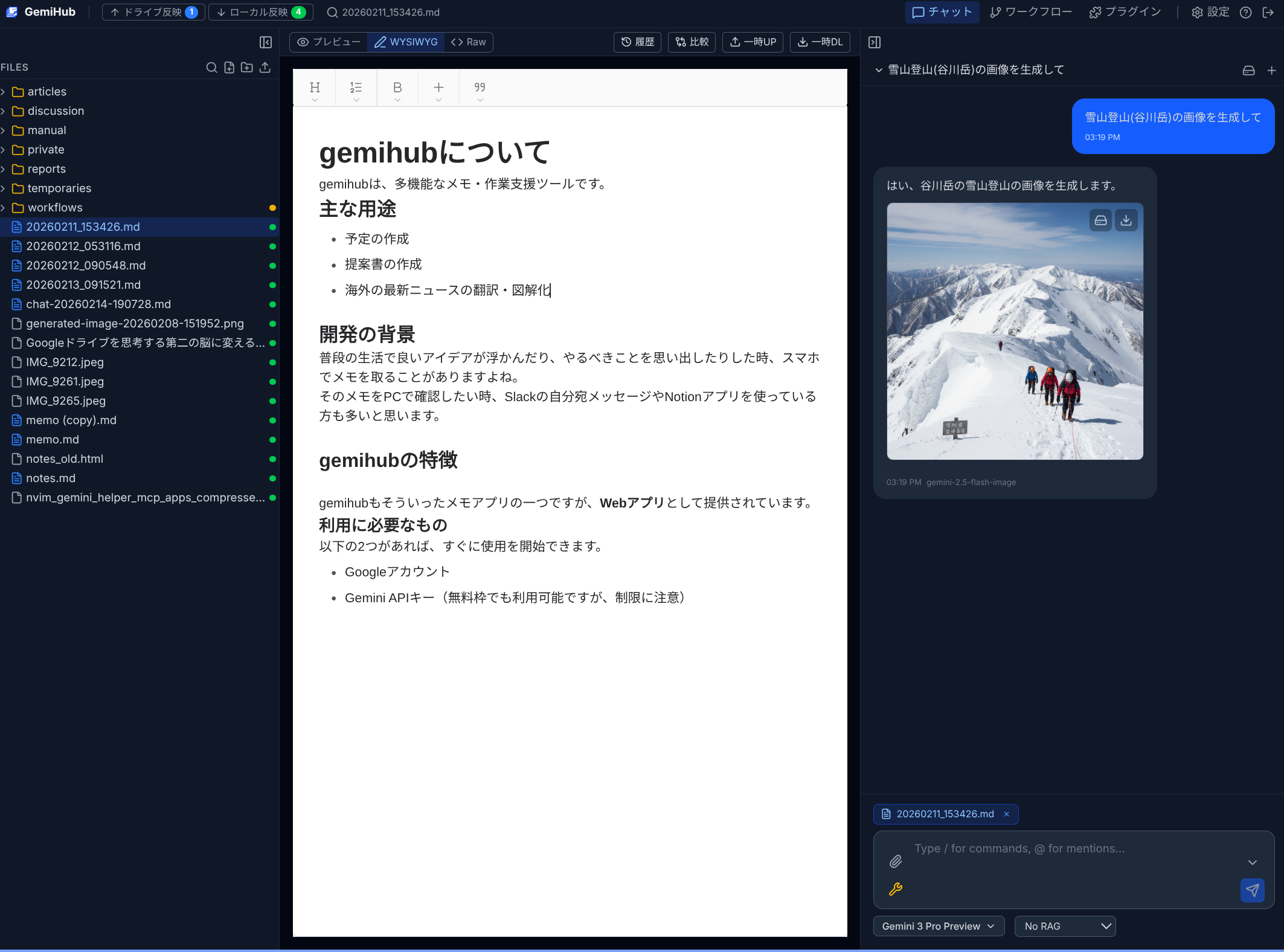
- Panel tabs — Toggle between Chat, Workflow, and Plugin panels on the right.
- Settings — Opens the Settings page.
- Manual — Opens this user manual in a new tab.
- Logout — Signs out of GemiHub.
Left Sidebar
The left sidebar shows the file tree from your Google Drive gemihub/ folder. You can:
- Click a file to open it in the Main Viewer.
- Right-click for context menu actions (rename, download, delete, publish, encrypt, etc.).
- Create new files or folders using the toolbar buttons at the top.
- Switch to the Search panel with Ctrl+Shift+F / Cmd+Shift+F.
Main Viewer
The central area displays the currently selected file. Content adapts based on file type:
- Markdown (.md) — Preview, WYSIWYG, and Raw editing modes with a mode switcher.
- Workflow (.yaml) — Visual Mermaid diagram in Preview mode, YAML editor in Raw mode.
- Images — Image viewer with zoom.
- PDF — Embedded PDF viewer.
- Audio / Video — Media player.
- Encrypted (.encrypted) — Password prompt, then decrypted content editor.
The Diff mode lets you compare the current file side-by-side with any other file.
Right Sidebar
Toggle between panels using the header tabs:
- Chat — AI chat panel with conversation history, model selection, and tool settings.
- Workflow — Workflow properties editor and execution panel (when a YAML file is selected).
- Plugins — Custom sidebar views provided by installed plugins.
Mobile Layout
On small screens, the layout adapts: the left sidebar becomes a bottom-sheet or a toggleable drawer, and the right panel tabs appear in a bottom navigation bar.